
Engineering and Territories Research
Tetis
Engineering and Territories Research
Graphic Design
Website
packaging
Museography
Product Design
Logo / Identity
Film / Animation
Mobile App
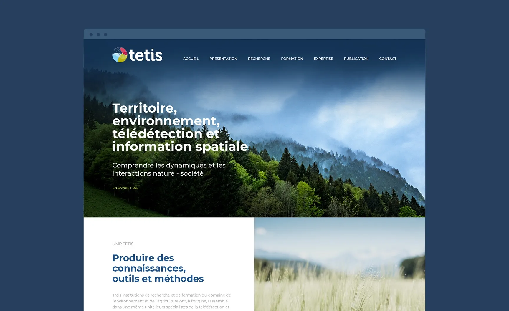
Tetis, spatial information for land management
Tetis is a research, teaching and consulting unit that uses spatial information for agri-environmental research and sustainable land management. These fields of application concern agriculture, the environment, territories, resources, health and natural risks. We were asked to create a complete new identity that would maintain the filiation with the old logo.
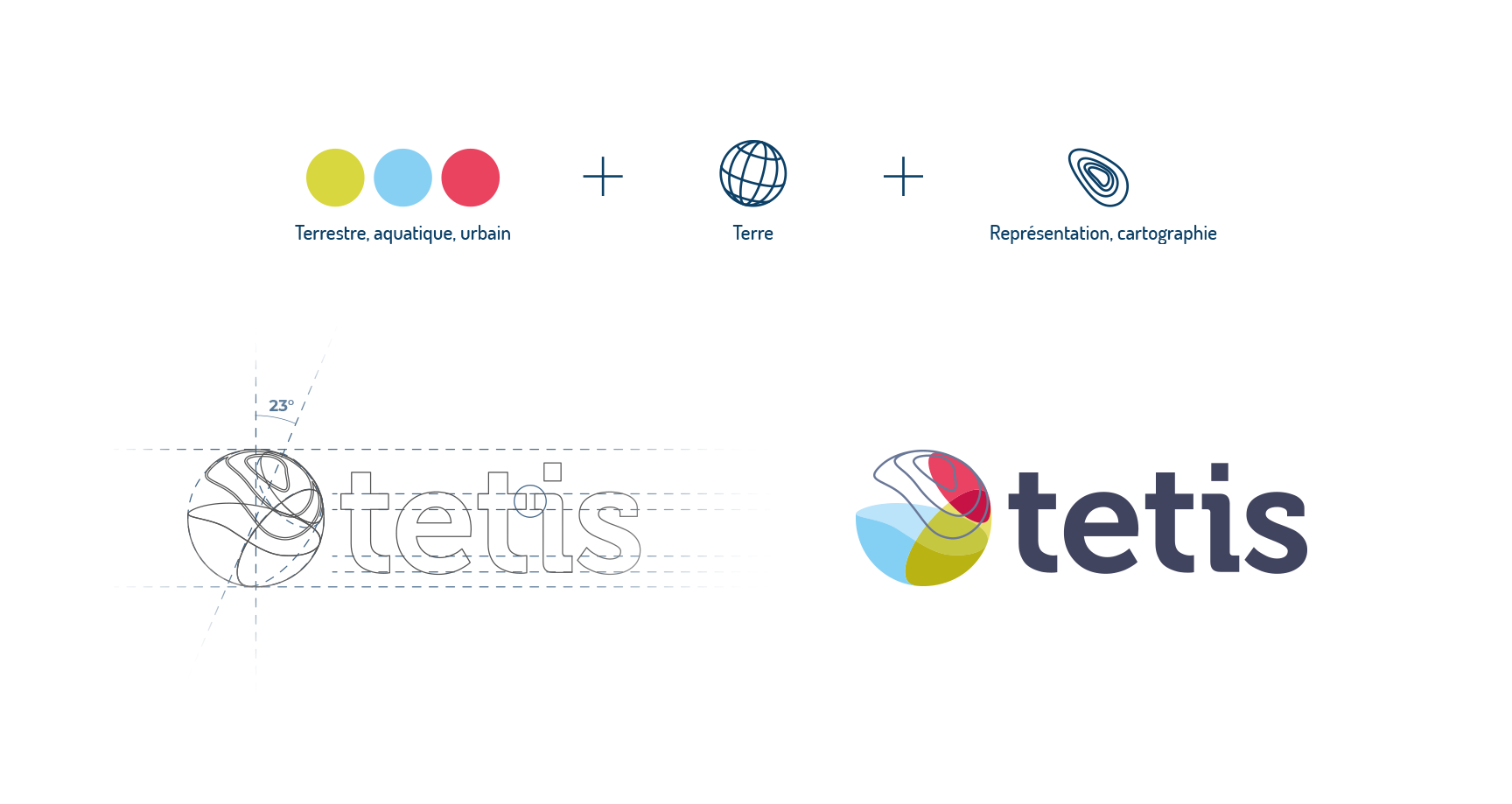
Logo
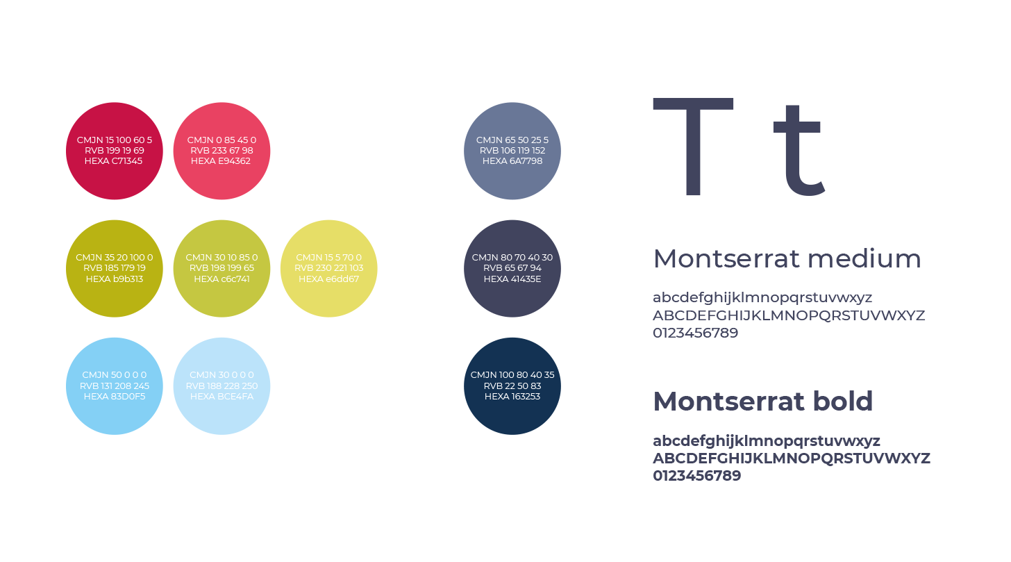
The client wanted to keep a filiation with the old logo: the Earth as well as the 3 colors red, green and blue. These three colors represent the RGB components for the spatial image analysis aspect. But they also have a particular meaning for their profession: blue for water (sea, lakes, rivers, etc.), green for nature (natural areas, agriculture, etc.) and red for urbanized areas. It was also necessary to move away from an overly technical representation, to give a lively and human image.
Identity
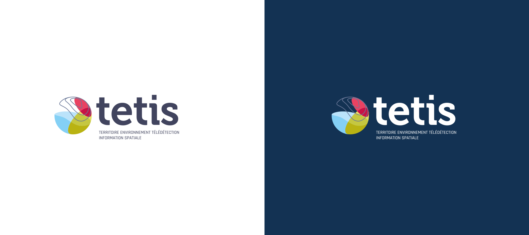
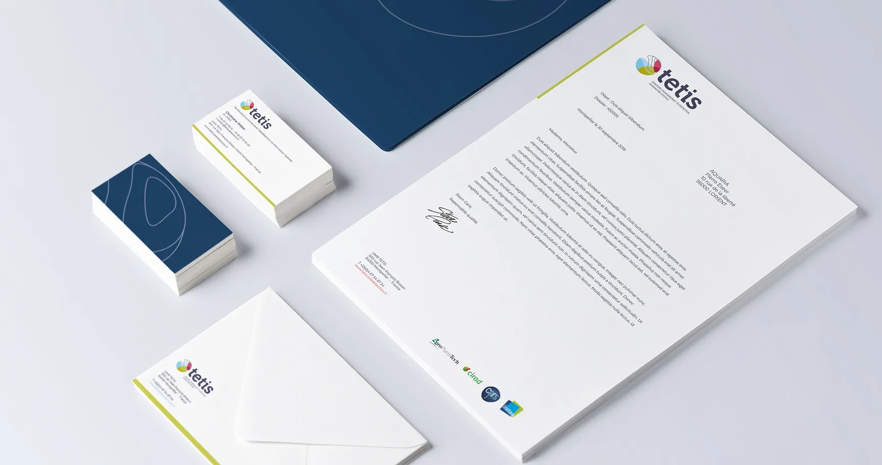
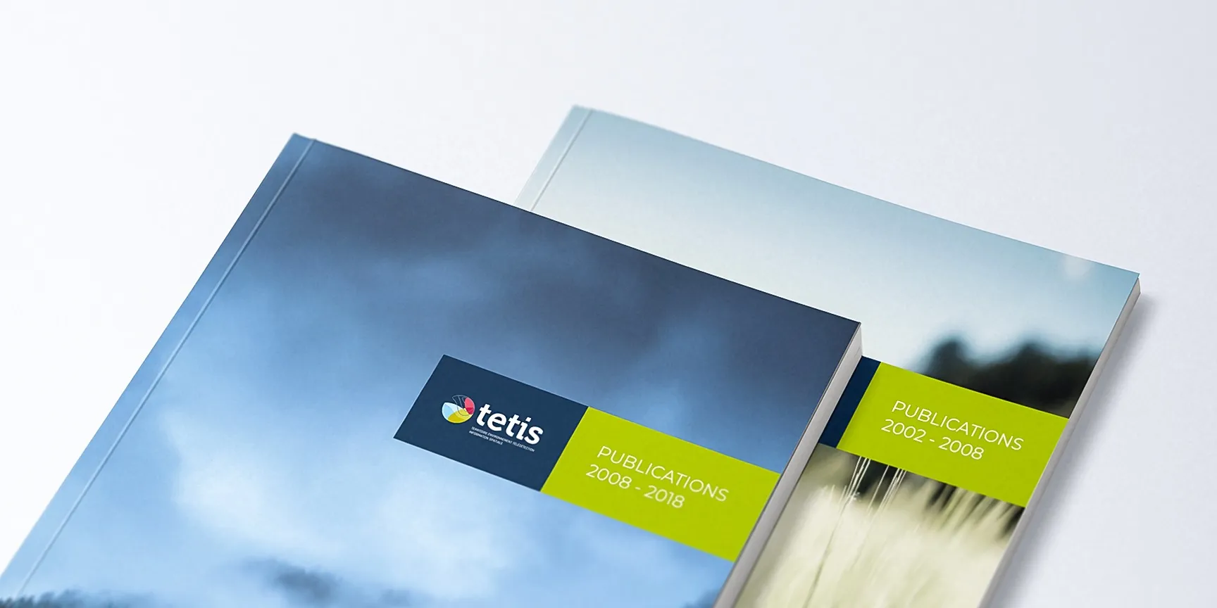
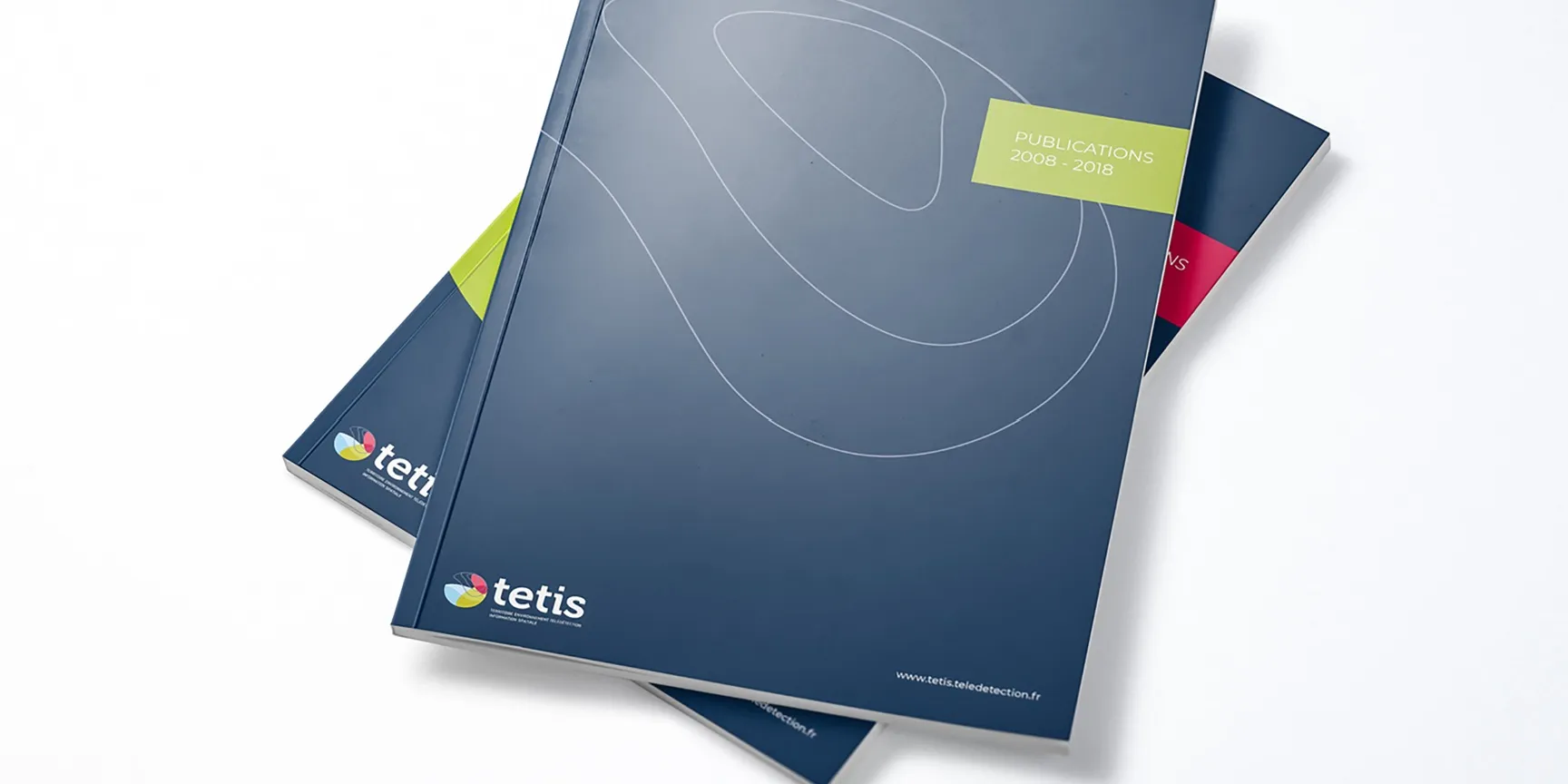
We completed this study with a graphic identity consisting of a strong and clear colour palette, as well as various graphic elements (shapes and lines) allowing the universe to be declined on various media: correspondence suite, file covers, web layout, etc.
Other achievements
All our achievements

TEC intex
Import and export company

Solar Box
Eco-friendly studios & self-contained homes
Showreel
Play